> Bind input actions to your own UI elements so they drive player input.
# UI Input Binding
`UiInputBinding` turns any UI element into a control button. Bind an element to one or more [`InputAction`](/docs/creator/sdk7/interactivity/button-events/click-events/#pointer-buttons)s, and while it's pressed — by touch or pointer — those actions are held down, driving both the local player's input (movement, jumping) and any scene [`InputAction`](/docs/creator/sdk7/interactivity/button-events/click-events/#pointer-buttons) listeners, exactly like the native on-screen buttons.
Use it to build your own touch controls. It's typically paired with [On-screen Controls](/docs/creator/sdk7/interactivity/touch-screen-controls/): hide the native buttons, then put your own in their place.
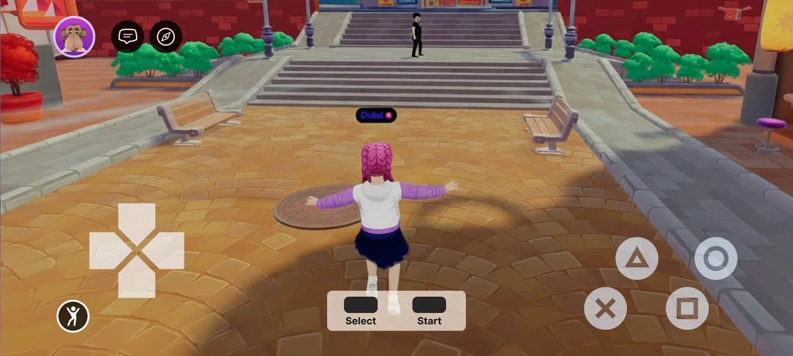
A fully custom gamepad built from UI elements — each button is a UI entity bound to an input action
## Bind an action to a UI element
Add a `uiInputBinding` prop to any element in your `.tsx` UI and list the actions to hold while it's pressed. The prop is available on every UI element ([`UiEntity`](/docs/creator/sdk7/2d-ui/onscreen-ui/#ui-entities), [`Button`](/docs/creator/sdk7/2d-ui/onscreen-ui/#ui-entities), [`Label`](/docs/creator/sdk7/2d-ui/onscreen-ui/#ui-entities), …), just like `uiTransform` and `uiBackground`.
**A button that moves the player forward while held:**
```tsx
import { InputAction } from '@dcl/sdk/ecs'
import { Button } from '@dcl/sdk/react-ecs'
export const forwardButton = () => (
)
```
## Build a custom control cluster
Combine several bound elements to assemble a full control scheme.
**A movement button plus an action button that fires `IA_PRIMARY`:**
```tsx
import { InputAction } from '@dcl/sdk/ecs'
import { Button, UiEntity } from '@dcl/sdk/react-ecs'
export const customControls = () => (
)
```
The bound actions behave just like the native buttons: `IA_FORWARD` / `IA_BACKWARD` / `IA_LEFT` / `IA_RIGHT` move the avatar, and any action can be read by your scene's [`InputAction`](/docs/creator/sdk7/interactivity/button-events/click-events/#pointer-buttons) listeners. Removing the prop (or the component) releases the binding.
## Properties
| Property | Type | Description |
| --- | --- | --- |
| `actions` | array of [`InputAction`](/docs/creator/sdk7/interactivity/button-events/click-events/#pointer-buttons) | The input actions held down while this element is pressed. See [Click events](/docs/creator/sdk7/interactivity/button-events/click-events/) for the full list of [`InputAction`](/docs/creator/sdk7/interactivity/button-events/click-events/#pointer-buttons) values. |
> [!NOTE]
> Pair this with [`TouchScreenControls`](/docs/creator/sdk7/interactivity/touch-screen-controls/) to hide the native controls and replace them with your own touch UI — the recommended way to ship a fully custom control scheme.
## Related
* [On-screen Controls](/docs/creator/sdk7/interactivity/touch-screen-controls/)
* [UI Button Events](/docs/creator/sdk7/2d-ui/ui_button_events/)
* [Input on mobile](/docs/creator/build-for-mobile/develop/input-on-mobile/)
* [Click events](/docs/creator/sdk7/interactivity/button-events/click-events/)