'/%3e%3cpath%20fill-rule='evenodd'%20clip-rule='evenodd'%20d='M18%2080.9996C25.515%2086.6471%2034.875%2089.9996%2045%2089.9996C55.125%2089.9996%2064.485%2086.6471%2072%2080.9996H18Z'%20fill='%23FF2D55'/%3e%3cpath%20fill-rule='evenodd'%20clip-rule='evenodd'%20d='M9.00008%2071.9996C11.5651%2075.3971%2014.6026%2078.4346%2018.0001%2080.9996H72C75.3975%2078.4346%2078.435%2075.3971%2081%2071.9996H9.00008Z'%20fill='%23FFA25A'/%3e%3cpath%20fill-rule='evenodd'%20clip-rule='evenodd'%20d='M60.3675%2062.9997H3.75757C5.15257%2066.2172%206.93007%2069.2322%209.00006%2071.9997H60.39V62.9997H60.3675Z'%20fill='%23FFC95B'/%3e%3cpath%20fill-rule='evenodd'%20clip-rule='evenodd'%20d='M31.8826%2029.2496V62.9996H60.0075L31.8826%2029.2496Z'%20fill='url(%23paint1_linear_1_49380)'/%3e%3cpath%20fill-rule='evenodd'%20clip-rule='evenodd'%20d='M3.75757%2062.9997H31.8826V29.2497L3.75757%2062.9997Z'%20fill='white'/%3e%3cpath%20fill-rule='evenodd'%20clip-rule='evenodd'%20d='M60.3675%2047.25V72H81L60.3675%2047.25Z'%20fill='url(%23paint2_linear_1_49380)'/%3e%3cpath%20fill-rule='evenodd'%20clip-rule='evenodd'%20d='M39.7574%2072H60.3674V47.25L39.7574%2072Z'%20fill='white'/%3e%3cpath%20fill-rule='evenodd'%20clip-rule='evenodd'%20d='M60.3675%2040.4997C66.5807%2040.4997%2071.6175%2035.4629%2071.6175%2029.2497C71.6175%2023.0365%2066.5807%2017.9997%2060.3675%2017.9997C54.1543%2017.9997%2049.1175%2023.0365%2049.1175%2029.2497C49.1175%2035.4629%2054.1543%2040.4997%2060.3675%2040.4997Z'%20fill='%23FFC95B'/%3e%3cpath%20fill-rule='evenodd'%20clip-rule='evenodd'%20d='M31.8824%2022.4997C34.989%2022.4997%2037.5074%2019.9813%2037.5074%2016.8747C37.5074%2013.7681%2034.989%2011.2497%2031.8824%2011.2497C28.7758%2011.2497%2026.2574%2013.7681%2026.2574%2016.8747C26.2574%2019.9813%2028.7758%2022.4997%2031.8824%2022.4997Z'%20fill='%23FFC95B'/%3e%3cdefs%3e%3clinearGradient%20id='paint0_linear_1_49380'%20x1='45'%20y1='-18.6396'%20x2='-18.6396'%20y2='45'%20gradientUnits='userSpaceOnUse'%3e%3cstop%20stop-color='%23FF2D55'/%3e%3cstop%20offset='1'%20stop-color='%23FFBC5B'/%3e%3c/linearGradient%3e%3clinearGradient%20id='paint1_linear_1_49380'%20x1='31.8731'%20y1='29.2497'%20x2='31.8731'%20y2='62.9996'%20gradientUnits='userSpaceOnUse'%3e%3cstop%20stop-color='%23A524B3'/%3e%3cstop%20offset='1'%20stop-color='%23FF2D55'/%3e%3c/linearGradient%3e%3clinearGradient%20id='paint2_linear_1_49380'%20x1='60.3605'%20y1='47.25'%20x2='60.3605'%20y2='72'%20gradientUnits='userSpaceOnUse'%3e%3cstop%20stop-color='%23A524B3'/%3e%3cstop%20offset='1'%20stop-color='%23FF2D55'/%3e%3c/linearGradient%3e%3c/defs%3e%3c/svg%3e)
UI Editor
Design your scene's on-screen UI visually in the Creator Hub, on a canvas instead of in code.
The UI Editor lets you build your scene's on-screen interface by dragging widgets onto a canvas, instead of writing layout code by hand. It writes real files into your scene, so anything you make here is normal SDK7 UI that you can keep editing in code.
Open it
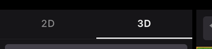
Use the 2D / 3D switch at the top of the editor's left panel. 3D is the scene canvas you already know. 2D is the UI Editor.
📔 Note: The UI Editor needs @dcl/sdk version 7.26.0 or newer in your scene. On an older scene the 2D tab shows a UI Editor Unavailable notice instead of the canvas, with an Update SDK button that upgrades the scene for you and a Maybe later button to dismiss it.
The Creator Hub remembers whether you left a scene in 2D or 3D and reopens it the same way. This is stored per project and is never published with your scene.
If you are using the Bevy scene renderer, switching to 2D pauses the running scene, and going back to 3D resumes it if it was running before.
Make your first UI
- Switch to the 2D tab.
- Click New GUI, either the button in the middle of the empty canvas or the + next to GUIs in the left panel. A GUI is one UI component, stored in its own file.
- Drag a widget from the palette along the bottom onto the canvas. Full Screen is a good first widget, it gives you a root that covers the screen. Then drop other widgets inside it.
- Select a widget and set its properties in the right panel.
There is no save button. The editor writes your changes to disk as you go, and the badge at the left of the toolbar reads All changes saved.
The panels
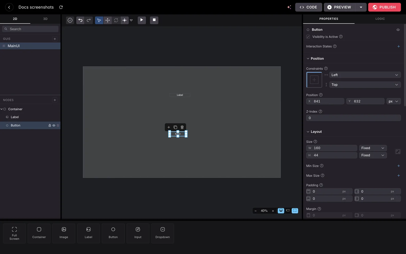
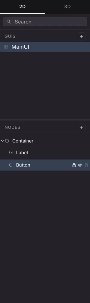
- Left: GUIs, the list of your UI components, and Nodes, the tree of the selected one. A search box filters both. Hover a node to lock, hide or delete it.
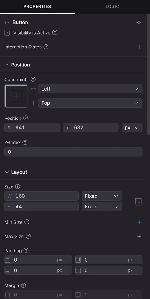
- Right: a Properties tab for the selected node, and a Logic tab.
- Bottom: the widget palette. Drag a card onto the canvas to add it.
- Middle: the canvas. Drag nodes to move them, use the handles to resize, and pan freely with the mouse wheel or by dragging.
Two floating groups of controls sit in the bottom-right corner of the canvas:
- The preview group toggles the mobile HUD guides and the safe-area guides, and switches between Desktop preview and Mobile preview.
- The zoom group has a minus and a plus button, and a percentage readout. Click the percentage to reset the view.
Widgets

The palette groups widgets into three categories:
- Containers: Full Screen, Container, Image
- Text: Label, Button
- Input: Input, Dropdown
Full Screen is a container that fills whatever it is placed inside, which makes it a good starting point for a UI that should cover the screen.
Moving and resizing
The toolbar has three tool modes:
- Free: move and resize, the general-purpose mode.
- Move: drag only.
- Resize: handles only.
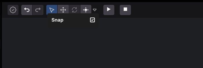
Positions snap to a 10 pixel grid. Hold Shift while dragging to move freely, ignoring the grid. The small arrow next to the tool buttons opens a Snap checkbox that turns snapping off entirely.
Layout: flow and free positioning
Two separate properties decide where a node ends up. Getting these straight saves a lot of confusion.
Flow is set on a container and decides how it arranges its children:
- Free: children stay wherever you put them.
- Row / Row reverse: children are laid out left to right, or right to left.
- Column / Column reverse: children are stacked top to bottom, or bottom to top.
- Wrap children: lets children spill onto more than one line when they don't fit.
Ignore Layout Flow is set on a child and decides whether that one node opts out of its parent's arrangement. Off, the parent positions it. On, you pin it yourself with Anchor and Position values.
Two consequences follow from this:
- Drop a widget into a Free container and it stays exactly where you dropped it.
- Drop it into a container with a direction and it joins the flow, taking its place in the line.
Switching a container to Free pins its existing children where they currently sit, so nothing jumps.
The root of a GUI is always positioned freely.
Other properties worth knowing
- Opacity: 100% is fully opaque, 0% fully transparent. The default is 100%.
- Scene Inset: which part of the screen the GUI sits in.
- Full Screen uses the whole renderable screen.
- Gameplay Safe Area stays clear of the client's own interface, such as chat, the minimap, and HUD indicators.
- Device Safe Area also avoids physical obstructions such as a notch or system bars. This option is offered when the canvas is in mobile preview.
If you give a GUI's root a width and a height in fixed pixels, the canvas frames it as an artboard of exactly that size rather than as a screen.
Check your UI on a phone
The controls in the bottom-right corner of the canvas switch the preview between a desktop screen and a phone. In mobile preview the canvas is drawn inside a phone frame, complete with a notch, so you can see where the screen edges actually fall.
Two sets of guides help you place things where players can see and reach them:
- Safe-area guides outline the part of the screen your GUI is confined to, matching the Scene Inset you picked. While the Scene Inset is Device Safe Area or Gameplay Safe Area the outline is always on, because it is what the GUI is clipped to. Set the Scene Inset to Full Screen and you can turn the outline on or off with the frame icon button.
- HUD guides draw the mobile client's own controls, such as the joystick, the jump and action buttons, the emote wheel, the profile, chat and compass. They are reference only, you cannot select or move them. The game controller button turns them on and off, it only appears in mobile preview, and the guides show by default when the Scene Inset is a safe area.
Content placed outside the safe area is not hidden, it is drawn past the outline. That overflow is the warning: in the real client it would sit under the game's own HUD.
📔 Note: These guides are an approximation for the editor only. The real areas are reported by the client at runtime and vary by device, so always confirm on a real phone. See Preview on mobile.
Customize the mobile controls
On the mobile client, players move and act through a set of native on-screen controls: a joystick, a crosshair, and a row of action buttons. The MobileHUD entry lets you reshape that HUD without writing code, and shows the result on the canvas as you go.
Once your scene has at least one GUI, MobileHUD appears as the first row of the GUIs list, above your own GUIs. Select it to open its panel on the right.
Three checkboxes at the top hide whole parts of the HUD:
- Hide Joystick: removes the movement stick.
- Hide Crosshair: removes the aiming reticle.
- Hide Input Actions: removes every action button at once.
Below them, the Input Actions section lists the eight buttons, in the order they fill the on-screen slots:
| Action | Button on screen |
|---|---|
IA_JUMP |
The large central button, by default |
IA_POINTER |
The interaction button |
IA_PRIMARY (E) |
The E button |
IA_SECONDARY (F) |
The F button |
IA_ACTION_3 (1) to IA_ACTION_6 (4) |
The numbered buttons |
Each row gives you three things:
- Main: a radio button that makes this action the large central button.
IA_JUMPis Main by default, and only one action can be Main at a time. - An eye icon that shows or hides that button. When you hide one, the lower buttons move up to fill the gap.
- Custom Icon: replaces the button's glyph with a
.png,.jpgor.jpegimage from your scene.
By default nothing is hidden and IA_JUMP is the main button, which is exactly what players get in a scene that doesn't touch the HUD.
💡 Tip: The numbered buttons normally sit behind a "+" overflow toggle. Hide enough of the higher buttons and they show directly. See On-screen Controls for how the slots fill.
The file it writes
Your changes are written to src/mobile-hud.ts, which exports a setupMobileHud() function built on the SDK's TouchScreenControls component:
import { engine, InputAction, TouchScreenControls } from '@dcl/sdk/ecs'

export function setupMobileHud() {
  TouchScreenControls.createOrReplace(engine.RootEntity, {
    hideJoystick: true,
    hideCrosshair: false,
    mainAction: InputAction.IA_PRIMARY,
    touchInputs: [
      { inputAction: InputAction.IA_ACTION_3, hide: true },
    ],
  })
}
The editor also adds the import and the call to your src/index.ts:
import { setupMobileHud } from './mobile-hud'

setupMobileHud()
The file only exists while it has something to say. If you set everything back to its default, or delete your last GUI, the Creator Hub deletes src/mobile-hud.ts and removes those two lines again.
📔 Note: While MobileHUD is selected the widget palette is disabled and the preview controls are hidden, since there is nothing to place and the HUD is mobile-only. Select one of your own GUIs to get them back.
Where the files go
The UI Editor edits your scene's real source files. There is no separate saved format.
- Each GUI is one
.tsxfile undersrc/ui/. src/ui/index.tsxis generated by the editor to gather them together. Don't edit it by hand.src/mobile-hud.tsholds your mobile controls, if you changed any. It sits outsidesrc/ui/on purpose, so it's never treated as a GUI.
If your scene has an older single src/ui.tsx file, the editor backs it up as src/ui.tsx.bak the first time you open the UI Editor.
Because these are ordinary files, you can open them in your code editor at any time. See UI for what the underlying code does.
Code the editor can't edit
The editor understands a particular shape of UI code. A node written some other way, for example built inside a loop or a conditional, or using a custom component or spread props, is drawn on the canvas as a grey block with a non-standard, edit in code badge. Its children are not shown, and you edit it in code instead.
The rest of the GUI around it keeps working normally.
Related pages
- UI: writing scene UI in code.
- Combine with code: open your scene in a code editor.
- Entities and Components: the 3D side of the editor.