'/%3e%3cpath%20fill-rule='evenodd'%20clip-rule='evenodd'%20d='M18%2080.9996C25.515%2086.6471%2034.875%2089.9996%2045%2089.9996C55.125%2089.9996%2064.485%2086.6471%2072%2080.9996H18Z'%20fill='%23FF2D55'/%3e%3cpath%20fill-rule='evenodd'%20clip-rule='evenodd'%20d='M9.00008%2071.9996C11.5651%2075.3971%2014.6026%2078.4346%2018.0001%2080.9996H72C75.3975%2078.4346%2078.435%2075.3971%2081%2071.9996H9.00008Z'%20fill='%23FFA25A'/%3e%3cpath%20fill-rule='evenodd'%20clip-rule='evenodd'%20d='M60.3675%2062.9997H3.75757C5.15257%2066.2172%206.93007%2069.2322%209.00006%2071.9997H60.39V62.9997H60.3675Z'%20fill='%23FFC95B'/%3e%3cpath%20fill-rule='evenodd'%20clip-rule='evenodd'%20d='M31.8826%2029.2496V62.9996H60.0075L31.8826%2029.2496Z'%20fill='url(%23paint1_linear_1_49380)'/%3e%3cpath%20fill-rule='evenodd'%20clip-rule='evenodd'%20d='M3.75757%2062.9997H31.8826V29.2497L3.75757%2062.9997Z'%20fill='white'/%3e%3cpath%20fill-rule='evenodd'%20clip-rule='evenodd'%20d='M60.3675%2047.25V72H81L60.3675%2047.25Z'%20fill='url(%23paint2_linear_1_49380)'/%3e%3cpath%20fill-rule='evenodd'%20clip-rule='evenodd'%20d='M39.7574%2072H60.3674V47.25L39.7574%2072Z'%20fill='white'/%3e%3cpath%20fill-rule='evenodd'%20clip-rule='evenodd'%20d='M60.3675%2040.4997C66.5807%2040.4997%2071.6175%2035.4629%2071.6175%2029.2497C71.6175%2023.0365%2066.5807%2017.9997%2060.3675%2017.9997C54.1543%2017.9997%2049.1175%2023.0365%2049.1175%2029.2497C49.1175%2035.4629%2054.1543%2040.4997%2060.3675%2040.4997Z'%20fill='%23FFC95B'/%3e%3cpath%20fill-rule='evenodd'%20clip-rule='evenodd'%20d='M31.8824%2022.4997C34.989%2022.4997%2037.5074%2019.9813%2037.5074%2016.8747C37.5074%2013.7681%2034.989%2011.2497%2031.8824%2011.2497C28.7758%2011.2497%2026.2574%2013.7681%2026.2574%2016.8747C26.2574%2019.9813%2028.7758%2022.4997%2031.8824%2022.4997Z'%20fill='%23FFC95B'/%3e%3cdefs%3e%3clinearGradient%20id='paint0_linear_1_49380'%20x1='45'%20y1='-18.6396'%20x2='-18.6396'%20y2='45'%20gradientUnits='userSpaceOnUse'%3e%3cstop%20stop-color='%23FF2D55'/%3e%3cstop%20offset='1'%20stop-color='%23FFBC5B'/%3e%3c/linearGradient%3e%3clinearGradient%20id='paint1_linear_1_49380'%20x1='31.8731'%20y1='29.2497'%20x2='31.8731'%20y2='62.9996'%20gradientUnits='userSpaceOnUse'%3e%3cstop%20stop-color='%23A524B3'/%3e%3cstop%20offset='1'%20stop-color='%23FF2D55'/%3e%3c/linearGradient%3e%3clinearGradient%20id='paint2_linear_1_49380'%20x1='60.3605'%20y1='47.25'%20x2='60.3605'%20y2='72'%20gradientUnits='userSpaceOnUse'%3e%3cstop%20stop-color='%23A524B3'/%3e%3cstop%20offset='1'%20stop-color='%23FF2D55'/%3e%3c/linearGradient%3e%3c/defs%3e%3c/svg%3e)
UI Background
Set a background and border of a UI entity.
The following properties are used to set a background and border on a UI entity.
Background
A uiBackground component gives color or a texture an entity's area. It uses the size and position defined by the entity's uiTransform.
The following fields can be configured, all of them are optional:
color: The color to use on the entity, as a Color4 value.
💡 Tip: Make an entity semi-transparent by setting the 4th value of the Color4 to less than 1.
texture: The texture to display on the entity, this takes an object with various parameters about the texture. The same properties are available as in textures in materials on 3D entities.src: The path to the image file to use as a texture. (string)filterMode: (optional) Determines how pixels in the texture are stretched or compressed when rendered. . See Texture Scaling. (FilterMode = 'point' | 'bi-linear' | 'tri-linear')wrapMode: (optional) Determines how a texture is tiled onto an entity. This takes a value from theTextureWrapModeenum. See [Texture Wrapping]((See documentation). (WrapMode = 'repeat' | 'clamp' | 'mirror')
Tip: You can combine both
textureandcolorproperties on a singleuiBackgroundcomponent to produce a tinted texture.textureMode: Selects how you want the texture to adapt to the size of the entity that it's applied to. (TextureMode = 'nine-slices' | 'center' | 'stretch')enum, which supports the following vales:center: The texture is not stretched, it's positioned centered on the entity and parts of it may be cropped depending on the entity's size.stretch: The texture is stretched to match the entire surface of the entity.nine-slices: Parts of the texture are stetched to match the entire surface of the entity, leaving margins unstretched. See nine-slice textures.
avatarTexture: Display an avatar profile thumbnail, based on an avatar ID. See [Avatar Portraits]((See documentation).textureSlices: Determine the margins to use when using the nine-slice texture mode, see nine-slice textures. Set a number smaller than 1, as a fraction of the total width or height of the image.
Simple color:
ui.tsx file:
import { ReactEcs, UiEntity } from '@dcl/sdk/react-ecs'
import { Color4 } from '@dcl/sdk/math'

export const uiMenu = () => (
  <UiEntity
    uiTransform={{
      width: 700,
      height: 400
    }}
    uiBackground={{
        color: Color4.create(0.5, 0.8, 0.1, 0.6)
    }}
  />
)
index.ts file:
import { ReactEcsRenderer } from '@dcl/sdk/react-ecs'
import { uiMenu } from './ui'

export function main() {
    ReactEcsRenderer.setUiRenderer(uiMenu, { virtualWidth: 1920, virtualHeight: 1080 })
}
📔 Note: All the following snippets in this page assume that you have a .ts similar to the above, running the ReactEcsRenderer.setUiRenderer() function.
Repeated texture pattern:
import { UiEntity, ReactEcs } from '@dcl/sdk/react-ecs'

export const uiMenu = () => (
  <UiEntity
    uiTransform={{
      width: 700,
      height: 400
    }}
    uiBackground={{
        textureMode: 'center',
        texture: {
            src: "images/brick-wall-texture.png",
            wrapMode: 'repeat'
        }
    }}
  />
)
Borders
A few properties are used to set a border around a UI entity. These properties exist on the uiTransform component. They each allow you to set either a single value for all sides of the border, or different values for each side.
borderColor: The color to use on the entity, as a Color4 value.borderWidth: The width of the border, as a number in pixels. It also supports values in percentages, for exampleborderWidth: '2%'will set the border width to 2% of the entity's width.borderRadius: Use this property to give the corners of the entity a rounded border. It sets the radius of the corners in pixels.
import { UiEntity, ReactEcs } from '@dcl/sdk/react-ecs'
import { Color4 } from '@dcl/sdk/math'

export const uiMenu = () => (
  <UiEntity
    uiTransform={{
      width: 700,
      height: 400,
      borderColor: Color4.Red(),
      borderWidth: 4,
      borderRadius: 10
    }}
  />
)
borderWidth, borderColor and borderRadius can also be set with different values for each side of the entity.
import { UiEntity, ReactEcs } from '@dcl/sdk/react-ecs'
import { Color4 } from '@dcl/sdk/math'

export const uiMenu = () => (
  <UiEntity
    uiTransform={{
      width: 700,
      height: 400,
      borderColor: { top: Color4.White(), left: Color4.Red(), right: Color4.Blue(), bottom: Color4.Gray() },
      borderRadius: { topLeft: 20, topRight: 20, bottomLeft: 20, bottomRight:0 },
      borderWidth: { top: 3, left: 2, right: 3, bottom: 4 }
    }}
  />
)
Opacity
Use the opacity property in the uiTransform of a UiEntity to add transparency to the entity and all of its children. The opacity property is a value from 0 to 1, where 0 is fully transparent and 1 fully opaque.
import { UiEntity, ReactEcs } from '@dcl/sdk/react-ecs'
import { Color4 } from '@dcl/sdk/math'

export const uiMenu = () => (
  <UiEntity
    uiTransform={{
      width: 700,
      height: 400,
      opacity: 0.7
    }}
    uiBackground={{ color: Color4.Green() }}
  >
    <UiEntity
        uiTransform={{
          width: 100,
          height: 30,
        }}
        uiText={{
          value: "This text is transparent too",
          fontSize: 40
        }}
      />
   </UiEntity>
)
The opacity value affects all children of a UiEntity, applying transparency to background colors, text colors, and background images. When both the parent and a child have opacity values, the child's final opacity is the product of its own value and the parent's.
import { UiEntity, ReactEcs } from '@dcl/sdk/react-ecs'
import { Color4 } from '@dcl/sdk/math'

export const uiMenu = () => (
  <UiEntity
    uiTransform={{
      width: 700,
      height: 400,
      opacity: 0.7
    }}
    uiBackground={{ color: Color4.Green() }}
  >
    <UiEntity
      uiTransform={{
        width: 100,
        height: 30,
        opacity: 0.7
      }}
      uiText={{
        value: "This text is even more transparent",
        fontSize: 40
      }}
    />
  </UiEntity>
)
Nine-slice textures
You can use 9-slice scaling with your textures, to ensure that corners and margins don't get stretched unevenly.
With this popular technique, you slice an image into 9 segments, that will be stretched in different ways to preserve the proportions of the margins and corners. For example, use this to define rounded-corner backgrounds that easily adapt to any size. Consider the following image (borrowed from Wikipedia):

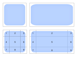
In this image we see the orginal texture (top-left), and the result of scaling it in a traditional way (top-right); notice how the corners get deformed. Below that, we see the texture segmented into 9 slices (bottom-left), and then the result of stretching the image according to the 9-slice method (bottom-right).
Here's how each segment is affected, using the above image as reference.
- Segment 5 is the only part of the image that is fully stretched on both x and y axis.
- Segments 1,3, 7, and 9 (the corneres) arent stetched at all.
- Segments 2 and 8 are only stetched horizontally
- Segments 4 and 6 are only stegched vertically.
To use nine-slice stretching on an entity, set the textureMode to 'nine-slices'. You can optionally also set a width for the margin on each side in textureSlices.
import { UiEntity, ReactEcs } from '@dcl/sdk/react-ecs'

export const uiMenu = () => (
  <UiEntity
    uiTransform={{ width: 700, height: 400 }}
    uiBackground={{
      textureMode: 'nine-slices',
      texture: {
        src: 'images/rounded_alpha_square.png'
      },
      textureSlices: {
        top: 0.2,
        bottom: 0.2,
        left: 0.2,
        right: 0.2
      }
    }}
  />
)
Texture UVs
Use the uvs property on a uiBackground component to display a specific region of a texture. This is useful for picking individual sprites from a sprite sheet, or for rotating an image.
The uvs field takes an array of 8 numbers, representing 4 pairs of UV coordinates for the four corners of the texture region. The order is: bottom-left, top-left, top-right, bottom-right. Each value ranges from 0 to 1, where (0, 0) is the bottom-left corner of the image and (1, 1) is the top-right.
💡 Tip: When using custom uvs, set textureMode to 'stretch' so the selected region fills the entity's area.
Sprites from a sprite sheet
To display a portion of a larger image (for example, one card from a sprite sheet that contains several), set the uvs to the coordinates of that region.
import { UiEntity, ReactEcs } from '@dcl/sdk/react-ecs'

// Display the left half of a texture (e.g. the first card in a 2-column sheet)
export const uiMenu = () => (
  <UiEntity
    uiTransform={{ width: 200, height: 300 }}
    uiBackground={{
      textureMode: 'stretch',
      texture: { src: 'images/card-atlas.png' },
      uvs: [
        // bottom-left, top-left, top-right, bottom-right
        0, 0,
        0, 1,
        0.5, 1,
        0.5, 0
      ]
    }}
  />
)
For a sprite sheet with a grid of frames (for example, a 4-column by 2-row sheet), calculate UVs based on the column and row of the frame you want:
import { UiEntity, ReactEcs } from '@dcl/sdk/react-ecs'

// Pick a single frame from a grid sprite sheet
function getFrameUVs(col: number, row: number, totalCols: number, totalRows: number): number[] {
  const stepU = 1 / totalCols
  const stepV = 1 / totalRows
  const left = col * stepU
  const right = (col + 1) * stepU
  const top = 1 - row * stepV
  const bottom = 1 - (row + 1) * stepV
  return [
    left, bottom,
    left, top,
    right, top,
    right, bottom
  ]
}

// Display column 2, row 0 of a 4x2 sprite sheet
export const uiMenu = () => (
  <UiEntity
    uiTransform={{ width: 128, height: 128 }}
    uiBackground={{
      textureMode: 'stretch',
      texture: { src: 'images/spritesheet.png' },
      uvs: getFrameUVs(2, 0, 4, 2)
    }}
  />
)
Rotating an image with UVs
You can rotate a texture by applying a 2D rotation to the UV coordinates. This is useful for spinner or loading indicators without needing transform-based rotation.
import { UiEntity, ReactEcs } from '@dcl/sdk/react-ecs'
import { engine } from '@dcl/sdk/ecs'

// Rotate a 2D point around a center
function rotate2D(angle: number, x: number, y: number, cx: number, cy: number): number[] {
  const cos = Math.cos(angle)
  const sin = Math.sin(angle)
  return [
    cos * (x - cx) - sin * (y - cy) + cx,
    sin * (x - cx) + cos * (y - cy) + cy
  ]
}

// Build rotated UV coordinates
function rotateUVs(angle: number): number[] {
  const uv00 = rotate2D(angle, 0, 0, 0.5, 0.5)
  const uv01 = rotate2D(angle, 0, 1, 0.5, 0.5)
  const uv11 = rotate2D(angle, 1, 1, 0.5, 0.5)
  const uv10 = rotate2D(angle, 1, 0, 0.5, 0.5)
  return [uv00[0], uv00[1], uv01[0], uv01[1], uv11[0], uv11[1], uv10[0], uv10[1]]
}

let spinnerAngle = 0

// System that updates the angle each frame
engine.addSystem((dt: number) => {
  spinnerAngle += dt * 5
})

export const uiMenu = () => (
  <UiEntity
    uiTransform={{ width: 128, height: 128 }}
    uiBackground={{
      textureMode: 'stretch',
      texture: { src: 'images/spinner.png' },
      uvs: rotateUVs(spinnerAngle)
    }}
  />
)
The rotateUVs function rotates the four UV corners around the center point (0.5, 0.5) by the given angle in radians. Because this is called each frame by the React-like renderer, the spinner updates smoothly.
💡 Tip: See a full working example with sprites, animated sprite sheets, spinners, and more in the UI Animations example scene.